Color, Font & Graphics
Iona University has a distinct palette of colors for use across all mediums. The colors are grouped in categories by primary and neutrals.
These colors play a huge role in defining who we are as an institution. Our modern palette helps us stand out and gives an identity to our entire organization. In order to ensure a cohesive and unified brand, these colors should be used consistently.
Base White
White
As a base for our identity, white space should feature a prominent role. Flooding designs with too much color can be overwhelming and off-putting.
CMYK: 0 / 0 / 0 / 0
RGB: 255 / 255 / 255
HEX: #ffffff

Primary Colors
Fighting MAROON
Fighting Maroon is our first primary color. It is best used as the point of emphasis for backgrounds or as the color of headline typography.
Pantone: 505 C
CMYK: 20 / 86 / 38 / 62
RGB: 111 / 44 / 62
HEX: #6f2c3e

Celtic GOLD
Celtic Gold is our second primary color. It is best used for accenting.
Pantone: 130 C
CMYK: 2 / 38 / 100 / 0
RGB: 240 / 171 / 0
HEX: #f0ab00

Light, Medium and Dark Cobblestone Gray
Light, Medium and Dark Cobblestone Gray are our neutral colors. These are best served as colors for typography or subtle accents when used in conjunction with our primary and accent colors.
Light Cobblestone GRAY
Pantone: Cool Gray 1 C
CMYK: 3 / 2 / 4 / 5
RGB: 224 / 225 / 221
HEX: #e0e1dd

Medium Cobblestone GRAY
Pantone: Cool Gray 6 C
CMYK: 18 / 11 / 8 / 23
RGB: 173 / 175 / 175
HEX: #adafaf

Dark Cobblestone GRAY
Pantone: 425 C
CMYK: 38 / 28 / 21 / 63
RGB: 86 / 90 / 92
HEX: #565a5c

Accent Colors
The colors on this spread are to be used sparingly for added accent when necessary. They are primarily for adding emphasis to web uses. Examples include calls-to-action, hover states, and rule lines. Use discretion when utilizing these colors as to not overpower our primary colors.
Before utilizing any accent colors, please contact University Marketing & Communications to confirm the colors are being applied in a way that is compliant with brand standards.
Deep Blue
Pantone: 281 C
CMYK: 100 / 90 / 31 / 34
RGB: 0 / 32 / 92
HEX: #002469

Baby Blue
Pantone: 291 C
CMYK: 36 / 3 / 0 / 0
RGB: 160 / 207 / 235
HEX: #a0cfeb

Aqua Green
Pantone: 338 C
CMYK: 49 / 0 / 28 / 0
RGB: 118 / 210 / 182
HEX: #76d2b6

Emerald Green
Pantone: 3405 C
CMYK: 90 / 0 / 70 / 0
RGB: 0 / 174 / 101
HEX: #00ae65

Iona University utilizes a variety of typefaces. Our main brand typeface Colus was modified specifically for the Iona University logo to reflect the unique heritage and spirit of unity of the campus. The standard version of the Colus typeface is preferred for all other marketing uses. These approved typefaces are broken into categories, so you can choose the appropriate typeface based on medium.
To ensure consistency of typefaces across users, our main brand typeface, COLUS, can be downloaded here, and our secondary typeface, ADRIANNA, can be downloaded here.
Iona University’s brand utilizes a number of visual elements to help tell our story. This includes the logo’s icon—or as we call it, the Celtic knot cross.
The geometry of the Celtic knot cross is fascinating and analogous to our University as a whole. Its free-flowing and intertwining nature makes it an efficient shape allowing for perfect load distribution and representing balance and union.
To us, the Celtic knot cross is representative of the strong building blocks our institution has used to create the Iona University we know today.
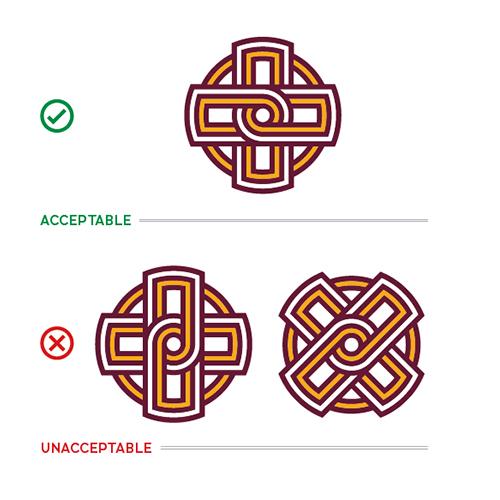
When utilizing the Celtic knot icon in any marketing or other promotional materials, be sure the icon is orientated in a manner matching its appearance within the primary University logo. The icon should NOT be rotated or used at a different angle that may alter the nature of the arcs of the inner knot.


When placing the Celtic knot icon over an image, be sure to avoid covering too much of the subject and action. The icon should act as a smaller, subtle branding element and not be the main focal point. The icon should be placed in either four corners of the image, preferably in an open area of the image that isn’t cluttered.

In the example above, you can see the icon is:
In the incorrect orientation
Is too large of a size
Covering the subject and action of the photo
Upon request, University Marketing & Communications can provide a pre-designed line art version of the Celtic knot icon in .PNG, .EPS and .AI formats with transparent backgrounds for simple application in different marketing and promotional materials. The line art version of the Celtic knot icon is available in three colors, Fighting Maroon, Celtic Gold and Medium Cobblestone Gray. When using using the Celtic knot line art tone-on-tone, use Iona University’s primary colors placing the Fighting Maroon line art at 90-95% tone or Celtic Gold line art at 55-60% tone of the same background color.
When utilizing the Celtic knot line art in any marketing or promotional materials, be sure the icon is orientated in a manner matching its appearance within the primary University logo. The line art should NOT be rotated or used at a different angle that may alter the nature of the arcs of the inner knot. The line art should be used as a subtle background element that doesn’t impede with written content.

Upon request, University Marketing & Communications can provide a pre-designed Celtic line pattern in .PNG, .EPS and .AI formats with transparent backgrounds for simple application in different marketing and promotional materials. The pattern is available in three colors, Fighting Maroon, Celtic Gold and Medium Cobblestone Gray. When using the Celtic line pattern art tone-on-tone, use Iona University’s primary colors placing the Fighting Maroon line art at 90-95% tone or Celtic Gold line art at 55-60% tone of the same background color. The same design restrictions of the Celtic knot line art apply. Elements of this line pattern can be used as a design tool in publication or digital design as long as the elements are used subtly and don’t impede the main subject matter. The curved elements surrounding this guide’s page numbers is a perfect example of proper use.

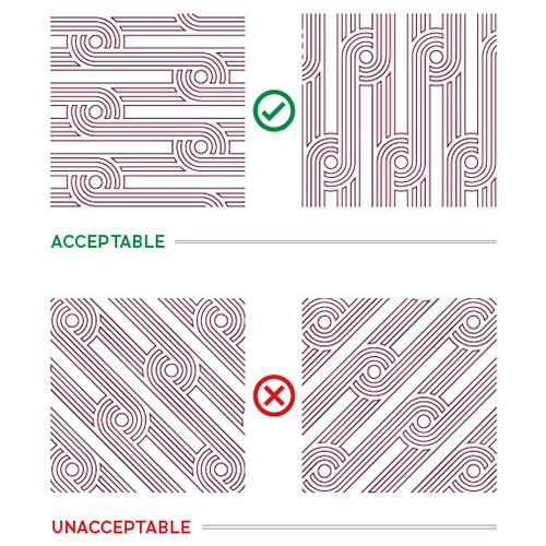
When utilizing the Celtic line pattern in any marketing or other promotional materials, be sure the pattern is orientated in a manner matching the pattern of the icon of the primary University logo. The pattern can be used horizontally and vertically and should be used solely as a background or edge accent.


When placing the Celtic line pattern over an image, be sure to avoid covering too much of the subject and action. The pattern should act as an accent piece and not be the main focal point. The pattern should be used in a strip that is placed along one of the sides and can subtly fade into the image. It should also bleed off the page as to not appear floating on the image.

In the example above, you can see the Celtic line pattern is:
In the incorrect orientation
Not properly bleeding off the page
Covering the subject and action of the photo
Back to Homepage • Who We Are • Our Brand
Logos • Color, Font & Graphics • Apparel & Gear
Photography • Editorial Standards • Download Brand Assets & Templates


