Photography
While the Iona University logo serves as our primary visual communication tool, the photography we use is also vital to the success of our brand and how well we’re able to tell our story.
The direction for our University’s imagery is realism with a unique perspective. This approach is derived from the forward-thinking and unconventional approach we apply to education and allows us to showcase the thinkers and the doers while visually communicating sentiments like inclusion, joy, and learning. Candid imagery with emotions is the basis for what will invoke engagement and create a meaningful connection between Iona University and each of our audiences.
Whether you’re shooting your own photography or are purchasing images from a website, you should always take a non-traditional approach to capturing and utilizing distinct, organic moments.
Whenever possible, be sure to use images created by Iona University. Original photography feels more genuine and serves to strengthen our brand. When shooting original images, use the examples shown in this Brand Guide as a visual reference and follow style considerations to capture an authentic visual representation of our mission and values, campus and students. As such—whether they are actual students or models—the people in our photographs should represent Iona in dress, age and ethnicity, but not at the expense of authenticity. Photos should represent Iona through genuine interaction, not forced logo wear or a formulaic assortment of subjects.
If you’re unable to capture your own photography, stock photos can be purchased to supplement Iona University’s existing photo library. As with original photography, use the creative standards found in this guide when purchasing visuals.
Emotion is the basis of why we do the things we do. Our photos should radiate emotion and action. Images should highlight moments of wonder, innovation and introspection.
Intimate, honest visuals have a profound effect on viewers. By showing the Iona University experience through that lens, we guarantee a meaningful connection with our audience.
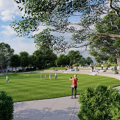
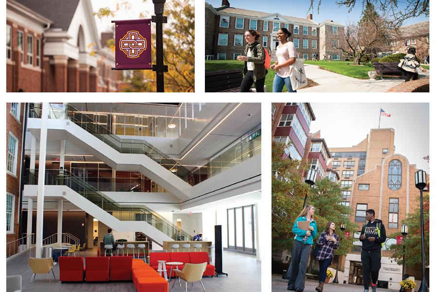
When composing your photographs, you should always be cognizant of your setting and environment. It’s important to showcase our campus dynamically. Visuals showing interaction, inclusion, and community are best suited for telling our story. Consider utilizing unique architecture and more interesting parts of our campus.
When choosing stock environment shots, be sure they are abstract enough as to not portray a false picture. Choose actual environment/local stock photos if a zoomed out visual is needed. Falsifying locations is not acceptable.
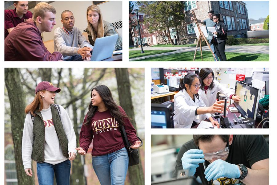
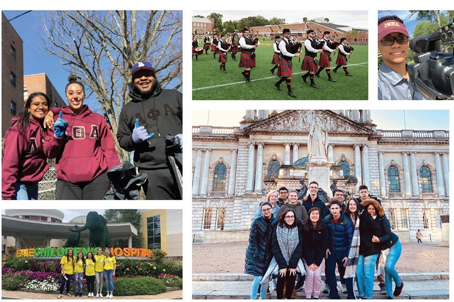
Service & Unity visuals should reinforce the forward-thinking service initiative at the heart of our mission, vision and values. The imagery should reveal service through thought, participation, wonder and togetherness. These images represent Iona University to both the greater world and our immediate community, so they should showcase the giving, friendly, adventurous example of our students learning, living and sharing through service.
In order to maintain authenticity, especially in this important area, these images should be used within the context of the content. Photos should feature staff and students in natural settings, moments and interactions.

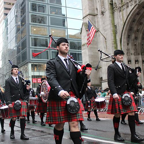
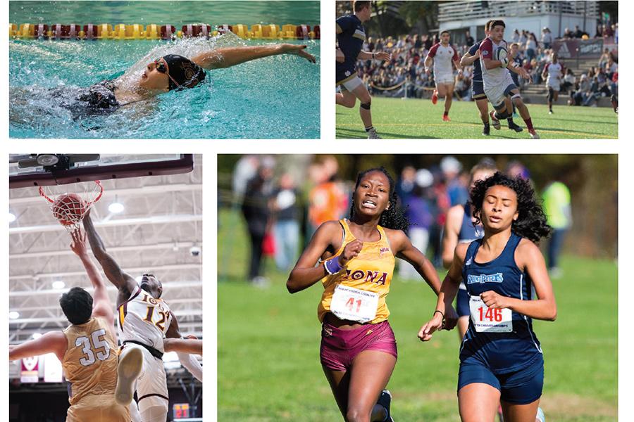
Activities encompass on-campus and off-campus events and interactions. The mood from activity photography should involve emotions like determination, leadership, comradery, and accomplishment. From sporting events to club activities, photos should focus both on the action and the people involved. They should create a connection to the subject matter and be strong enough to function as a standalone image.
Stock imagery can be used in abstract form for items such as close-ups of hands and feet, sports, or technology equipment. Stock photos for activities should be limited and not reveal itself as a non-Iona University event or activity in any way.
Activities encompass on-campus and off-campus events and interactions. The mood from activity photography should involve emotions like determination, leadership, comradery, and accomplishment. From organized events to club activities, photos should focus both on the action and the people involved. They should create a connection to the subject matter and be strong enough to function as a standalone image.
To maintain an authentic and genuine feel across our photography, try to utilize natural light as much as possible. If photographing in dark areas where studio light is necessary, avoid lighting the subject directly. Rather, bounce light into the shot to provide a more natural look and feel, while avoiding harsh highlights and shadows.
We strive for the viewer to feel as if they’re part of the scene. To ensure we achieve this, it is recommended our photography be shot from natural angles and points-of-view. Avoid shooting from high angles, unless it is evident the camera is in a location a viewer could possibly stand. Exception to this would be for environmental shots where unique angles are encouraged.
- Evident artificial lighting. (Harsh shadow on wall and overly lit subjects).
- Composition lacks true hierarchy.
- Shot from unnatural angle.
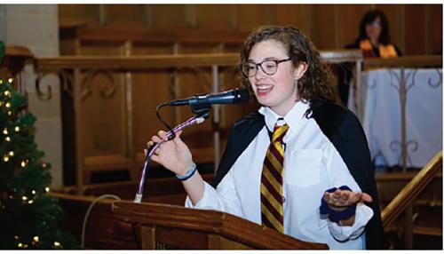
- Authentic pose and expression.
- Natural light (no harsh shadows or highlights).
- Shot from natural point of view.

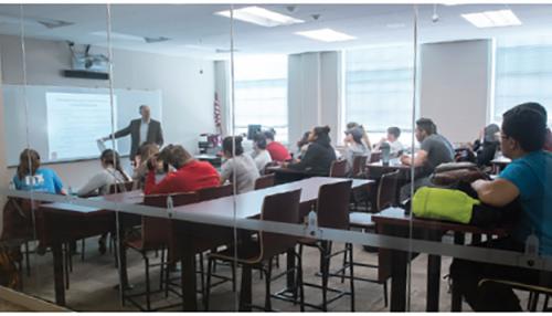
- Well lit with natural light.
- Dynamic composition.
- Genuine student poses.
When placing copy over darker background images, it is recommended to place the copy over a gradient for improved readability. The gradient doesn’t need to be used on lighter background images as long as the image doesn’t have obstructions that would degrade readability. At the edge of the image or layout, this gradient should either be Fighting Maroon or Celtic Gold with an opacity of 100% gradiating to 0%. This will allow the background to remain visible, yet provide enough contrast for the copy to remain readable.
IMPORTANT
- Whenever possible, a copy block should stay left justified.
- If using a gradient, it should fade without ruining the subject of the image.
- The Celtic line pattern design element can be used on an adjacent edge or on top of the gradient, but can not cover or impede legibility of the copy.
Suggested Copy Specifications
Headline
- Adrianna Regular or Colus
- Fighting Maroon (on light background) or White (on dark background)
- Title Case
Subheadline
- Adrianna Demibold
- Celtic Gold
- Title Case
Copy
- Adrianna Light
- Dark Cobblestone Gray (on light background) or Light Cobblestone Gray (on dark background)
- Sentence case
When composing your frame for any marketing photography, be mindful of the Rule of Thirds. This photography rule is important, not only for adding interest in your images, but also leaving enough area for copy and logos to be composited cleanly. The essence of this rule is as follows: if you divide the frame into three equal sections both up and down, the primary focus of attention should lie on, or very near, one of the created gridlines which denote one-third of the frame. As you can see in the examples on this spread, these photographs utilize this rule very effectively, and composite with type and graphics successfully.
When applying overlay graphics, do not combine both Celtic knot pattern and Celtic line pattern. These two elements should be used separately.

Our photography should avoid appearing overly posed. This can create a sense of dishonesty and lack of trust in our message. We strive to keep our imagery as genuine and honest as possible.

When lighting for photography, avoid poor lighting and composition in the scene. Natural light is preferred. If artificial light is necessary, be sure to bounce it in to diffuse and avoid harsh highlights and shadows.

Josh Cuppek
Website: www.cuppekphotography.com
Email: josh.cuppek@gmail.com
Phone: (862) 345-6577
Style: Campus, portraits, events
History with Iona: Has worked with us in athletics, photographed President Carey, and has done campus shoots for us.
Monika Graff
Website: www.monikagraff.com
Email: mg@monikagraff.com
Phone: (917) 270-8869
Style: Portraits, events
History with Iona: Has primarily shot events for us.
Ben Hider
Website: www.benhider.com
Email: info@benhider.com
Phone: (914) 316 6870
Style: Portraits, Campus, events
History with Iona: Great photojournalistic style for events or photo essays; Westchester local.
Back to Homepage • Who We Are • Our Brand
Logos • Color, Font & Graphics • Apparel & Gear
Photography • Editorial Standards • Download Brand Assets & Templates
